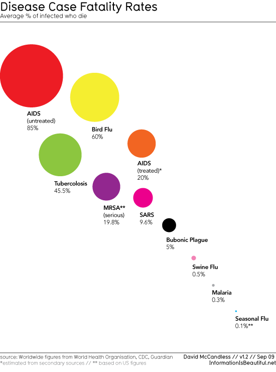
Swine flu mortality rates - bubble chart
Andrew Gelman over at his Statistical Modeling, Causal Inference, and Social Science blog often brings up figures that he thinks are good, bad, and ugly. I would like to continue that tradition here. I saw the figure below on Barry Ritholtz's The Big Picture blog. Now, Barry's blog has nothing to do with statistics or swine flu, but since everybody is interested in swine flu these days, he decided to put this figure on his blog. From a probabilistic perspective, the point of the figure is very clear, conditional on having the disease what is the probability of dying from it. I would be very interested in this quantity if I had the disease, but since I don't have any of these diseases (that I am aware of), I don't care. The quantity I'm interested in is my marginal probability of dying from the disease. (Certainly I would prefer a conditional probability where we condition on my age, gender, geographical location, etc, but that is asking a bit much). So although this is an interesting and colorful figure, it has no relevance (yet) to my situation, although I will be happy to know that my chances of surviving swine flu once I get it are pretty good.
Separately, why is the subtitle "Average % of infected who die"? Shouldn't it just be `% of infected who die'?

blog comments powered by Disqus

blog comments powered by Disqus