Employment recession
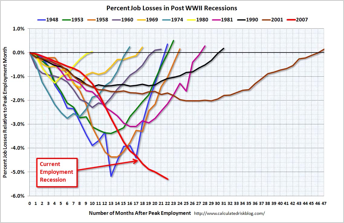
Originally posted by the blog Calculated Risk and then duplicated on The Big Picture, the figure below shows employment numbers for various recessions in U.S. history. Obviously this data is relevant to many people at the moment. Anybody in my PSTAT 262 care to take a stab at this data as part of their project?
I am curious why the data seem so jumpy in earlier years relative to the smooth curve for the current recession. Bad data gathering techniques? Untrustworthy news sources led to businesses not reacting at the same time?

blog comments powered by Disqus

blog comments powered by Disqus