Exploration of ridge regression
Ridge regression
This is a quick demonstration of ridge regression in the context of a simple example constructed by Marquardt and Snee in their paper Ridge Regression in Practice. This example generates data from the model y = x1+x2+x3+e for a total of 8 observations. A tuning parameter, a, determines the amount of correlation between x1 and x2. In the example from the paper and duplicated here, a is set to 0.1, 0.5, and 0.9 which corresponds to a correlation between x1 and x2 of 0.110, 0.667, and 0.989, respectively.
The purpose of this post is to simply take a look at the ridge traces, i.e. the plot of parmeter estimates vs the ridge penalty parameter, lambda, to get some understanding of how the penalty affects the ridge estimates.
The function below just recreates the data set for a particular value of a.
df = function(a) {
    mu = rep(1, 8)
    x1 = c(-1, 1, -1, 1, -1, 1, -(1 - 2 * a), (1 - 2 * a))
    x2 = c(-1, 1, -1, 1, (1 - 2 * a), -(1 - 2 * a), 1, -1)
    x3 = c(-1, -1, 1, 1, -1, -1, 1, 1)
    Ey = x1 + x2 + x3

    e = c(-0.305, -0.321, 1.9, -0.778, 6.17, -1.43, 0.267, 0.978)
    y = Ey + e
    return(data.frame(mu = mu, x1 = x1, x2 = x2, x3 = x3, Ey = Ey, e = e, y = y))
}
The plots below show the traces for the three values of a for the penalty parameter in the range 0 to 1.
library(MASS)
par(mfrow = c(1, 3))

ylm = 10
plot(lm.ridge(y ~ x1 + x2 + x3, df(0.1), lambda = seq(0, 1, 0.01)), main = "a=0.1",
    ylim = c(-ylm, ylm))
legend("topright", c("x1", "x2", "x3"), col = 1:3, lty = 1:3)

plot(lm.ridge(y ~ x1 + x2 + x3, df(0.5), lambda = seq(0, 1, 0.01)), main = "a=0.5",
    ylim = c(-ylm, ylm))
legend("topright", c("x1", "x2", "x3"), col = 1:3, lty = 1:3)

plot(lm.ridge(y ~ x1 + x2 + x3, df(0.9), lambda = seq(0, 1, 0.01)), main = "a=0.9",
    ylim = c(-ylm, ylm))
legend("topright", c("x1", "x2", "x3"), col = 1:3, lty = 1:3)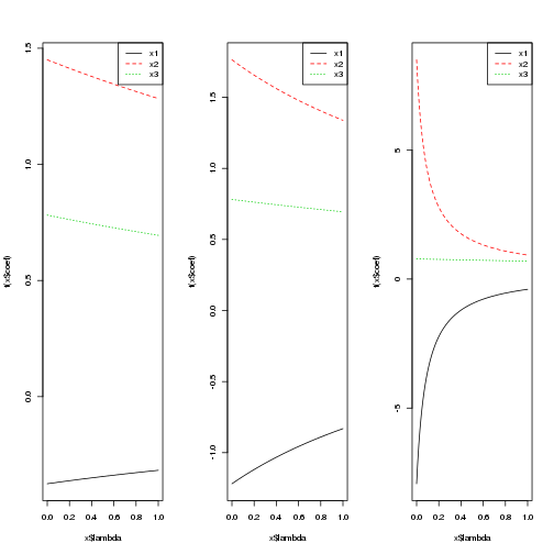
Unfortunately the ylim argument is having no impact, so the plots are not as comparable as I’d like. The y-axis ranges from -1.5 to 1.5 for a=0.1, from -2 to 2 for a=0.5, and -10 to 10 for a=0.9. At lambda=0, we obtain the least squares estimates. As lambda increases, we shrink these estimates back toward zero. The correlation between x1 and x2 is apparent in the estimates because x2 is larger than 1 (the truth) and x1 is negative.
The lm.ridge function also has the ability to select the penalty according to some criterion.
select(lm.ridge(y ~ x1 + x2 + x3, df(0.1), lambda = seq(0, 20, 1e-04)))## modified HKB estimator is 2.187
## modified L-W estimator is 2.283
## smallest value of GCV at 18.22select(lm.ridge(y ~ x1 + x2 + x3, df(0.5), lambda = seq(0, 10, 1e-04)))## modified HKB estimator is 0.8962
## modified L-W estimator is 1.993
## smallest value of GCV at 10select(lm.ridge(y ~ x1 + x2 + x3, df(0.9), lambda = seq(0, 10, 1e-04)))## modified HKB estimator is 0.02534
## modified L-W estimator is 1.425
## smallest value of GCV at 0.0275These results are certainly not consistent across the different methods of selecting the penalty. The generalized cross validation approach (GCV) always chooses the right endpoint even up to 1000 for a=0.5.
For another example of the ridge traces, we look at the example from the lm.ridge function.
longley # not the same as the S-PLUS dataset## GNP.deflator GNP Unemployed Armed.Forces Population Year Employed
## 1947 83.0 234.3 235.6 159.0 107.6 1947 60.32
## 1948 88.5 259.4 232.5 145.6 108.6 1948 61.12
## 1949 88.2 258.1 368.2 161.6 109.8 1949 60.17
## 1950 89.5 284.6 335.1 165.0 110.9 1950 61.19
## 1951 96.2 329.0 209.9 309.9 112.1 1951 63.22
## 1952 98.1 347.0 193.2 359.4 113.3 1952 63.64
## 1953 99.0 365.4 187.0 354.7 115.1 1953 64.99
## 1954 100.0 363.1 357.8 335.0 116.2 1954 63.76
## 1955 101.2 397.5 290.4 304.8 117.4 1955 66.02
## 1956 104.6 419.2 282.2 285.7 118.7 1956 67.86
## 1957 108.4 442.8 293.6 279.8 120.4 1957 68.17
## 1958 110.8 444.5 468.1 263.7 122.0 1958 66.51
## 1959 112.6 482.7 381.3 255.2 123.4 1959 68.66
## 1960 114.2 502.6 393.1 251.4 125.4 1960 69.56
## 1961 115.7 518.2 480.6 257.2 127.9 1961 69.33
## 1962 116.9 554.9 400.7 282.7 130.1 1962 70.55names(longley)[1] <- "y"
lm.ridge(y ~ ., longley)## GNP Unemployed Armed.Forces Population
## 2946.85636 0.26353 0.03648 0.01116 -1.73703
## Year Employed
## -1.41880 0.23129par(mfrow = c(1, 1))
plot(lm.ridge(y ~ ., longley, lambda = seq(0, 0.1, 0.001)))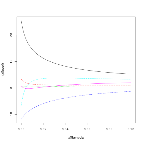
select(lm.ridge(y ~ ., longley, lambda = seq(0, 0.1, 1e-04)))## modified HKB estimator is 0.006837
## modified L-W estimator is 0.05267
## smallest value of GCV at 0.0057The main comment here is to note that the shrinkage is not monotonic for each individual variable. Notice the pink line starts above zero, then decreases below zero for small penalties, but then increase above zero and surpasses its least squares estimate. Similarly the light blue line starts at a relatively large negative value and then increases to a somewhat large positive value.
blog comments powered by Disqus